


Read summarized version with
 ChatGPT
'%3e%3cpath%20fill-rule='evenodd'%20clip-rule='evenodd'%20d='M16.4875%200V6.06H18.75V14.6833H16.3042V20L10.44%2014.8383V19.9592H9.53083V14.8325L3.66%2020V14.6125H1.25V5.99H3.65333V0L9.53083%205.41167V0.158333H10.4392V5.56667L16.4875%200ZM10.44%207.53667V13.6358L15.395%2017.9975V12.0333L10.44%207.53667ZM9.52417%207.47L4.56917%2011.9683V17.9975L9.52417%2013.6358V7.47083V7.47ZM16.3042%2013.7867H17.8408V6.9575H11.2167L16.3042%2011.5742V13.7867ZM8.81917%206.88667H2.15833V13.7158H3.65833V11.5692L8.81833%206.88583L8.81917%206.88667ZM4.5625%202.06333V5.98833H8.825L4.5625%202.06333ZM15.5783%202.06333L11.3158%205.98833H15.5783V2.06333Z'%20fill='black'/%3e%3c/g%3e%3cdefs%3e%3cclipPath%20id='clip0_4212_18220'%3e%3crect%20width='20'%20height='20'%20fill='white'/%3e%3c/clipPath%3e%3c/defs%3e%3c/svg%3e) Perplexity
Perplexity'%3e%3cpath%20d='M9.996%2019.992C9.996%2018.6068%209.73182%2017.3074%209.19632%2016.0936C8.68224%2014.8798%207.96824%2013.8159%207.0686%2012.9163C6.16896%2012.0166%205.11224%2011.3098%203.89844%2010.7957C2.68464%2010.2602%201.38516%209.996%200%209.996C1.38516%209.996%202.68464%209.73896%203.89844%209.21774C5.11224%208.68224%206.1761%207.96824%207.0686%207.0686C7.96824%206.16896%208.6751%205.11224%209.19632%203.89844C9.73182%202.68464%209.996%201.38516%209.996%200C9.996%201.38516%2010.253%202.68464%2010.7743%203.89844C11.3098%205.11224%2012.0238%206.1761%2012.9234%207.0686C13.823%207.96824%2014.8798%208.68224%2016.1007%209.21774C17.3145%209.73182%2018.614%209.996%2019.9991%209.996C18.614%209.996%2017.3145%2010.2602%2016.1007%2010.7957C14.8869%2011.3098%2013.823%2012.0166%2012.9234%2012.9163C12.0238%2013.8159%2011.3098%2014.8726%2010.7743%2016.0936C10.2538%2017.327%209.98905%2018.6533%209.996%2019.992Z'%20fill='url(%23paint0_radial_4212_18233)'/%3e%3c/g%3e%3cdefs%3e%3cradialGradient%20id='paint0_radial_4212_18233'%20cx='0'%20cy='0'%20r='1'%20gradientUnits='userSpaceOnUse'%20gradientTransform='translate(-1.13275%205.96185)%20rotate(18.68)%20scale(21.2772%20170.46)'%3e%3cstop%20offset='0.07'%20stop-color='%239168C0'/%3e%3cstop%20offset='0.34'%20stop-color='%235684D1'/%3e%3cstop%20offset='0.67'%20stop-color='%231BA1E3'/%3e%3c/radialGradient%3e%3cclipPath%20id='clip0_4212_18233'%3e%3crect%20width='20'%20height='19.992'%20fill='white'/%3e%3c/clipPath%3e%3c/defs%3e%3c/svg%3e) Gemini
Gemini'%3e%3cpath%20d='M3.92888%2013.2962L7.86008%2011.0903L7.92585%2010.8981L7.86008%2010.7918H7.66782L7.01009%2010.7513L4.76369%2010.6906L2.81581%2010.6097L0.928632%2010.5085L0.453044%2010.4073L0.0078125%209.82039L0.0533475%209.52694L0.453044%209.25879L1.02476%209.30939L2.28962%209.3954L4.18692%209.52694L5.56309%209.60789L7.60204%209.82039H7.92585L7.97138%209.68884L7.86008%209.60789L7.77407%209.52694L5.811%208.19631L3.68603%206.78978L2.57295%205.98027L1.97088%205.57045L1.66731%205.18593L1.53577%204.34607L2.08219%203.74399L2.81581%203.79459L3.00301%203.84518L3.74674%204.4169L5.33541%205.64634L7.40979%207.1743L7.71335%207.42727L7.83478%207.34126L7.84996%207.28055L7.71335%207.05287L6.5851%205.01391L5.38095%202.93954L4.84465%202.07943L4.70298%201.56337C4.65239%201.35087%204.61697%201.17379%204.61697%200.956236L5.23928%200.111308L5.58332%200L6.41307%200.111308L6.76218%200.414875L7.27824%201.59373L8.11305%203.45054L9.40827%205.97521L9.78773%206.72401L9.9901%207.41715L10.066%207.62965H10.1975V7.50822L10.3038%206.08652L10.5011%204.34101L10.6934%202.09461L10.7591%201.46218L11.0728%200.703263L11.6951%200.293448L12.1808%200.526183L12.5805%201.0979L12.5249%201.46724L12.2871%203.01037L11.8216%205.42879L11.5181%207.04781H11.6951L11.8975%206.84543L12.7171%205.75765L14.0933%204.03744L14.7005%203.35441L15.4088%202.60056L15.8641%202.24134H16.7242L17.3567%203.18239L17.0733%204.15381L16.1879%205.277L15.4543%206.22818L14.4019%207.64483L13.7442%208.77814L13.8049%208.86921L13.9618%208.85403L16.3397%208.34809L17.6248%208.11536L19.1578%207.85226L19.851%208.17607L19.9269%208.50493L19.6537%209.17784L18.0144%209.5826L16.0918%209.96711L13.2282%2010.6451L13.1927%2010.6704L13.2332%2010.721L14.5234%2010.8424L15.0749%2010.8728H16.4257L18.9403%2011.06L19.598%2011.4951L19.9926%2012.0263L19.9269%2012.4311L18.915%2012.9471L17.5489%2012.6233L14.3615%2011.8644L13.2686%2011.5912H13.1168V11.6823L14.0275%2012.5727L15.6972%2014.0804L17.7867%2016.0233L17.893%2016.5039L17.6248%2016.8834L17.3415%2016.8429L15.5049%2015.4617L14.7966%2014.8394L13.1927%2013.4885H13.0865V13.6302L13.4558%2014.1715L15.4088%2017.106L15.51%2018.0066L15.3683%2018.3L14.8624%2018.4771L14.3058%2018.3759L13.1624%2016.7721L11.9835%2014.9658L11.0324%2013.3468L10.916%2013.4126L10.3544%2019.4586L10.0913%2019.7673L9.48416%2020L8.97821%2019.6155L8.71006%2018.9932L8.97821%2017.7637L9.30202%2016.1599L9.56511%2014.8849L9.80291%2013.3013L9.94457%2012.7751L9.93445%2012.7397L9.81808%2012.7549L8.62405%2014.3941L6.80771%2016.848L5.37083%2018.386L5.02679%2018.5226L4.42977%2018.214L4.48542%2017.6625L4.81935%2017.1718L6.80771%2014.642L8.0068%2013.0736L8.7809%2012.168L8.77584%2012.0364H8.7303L3.44824%2015.4667L2.50718%2015.5882L2.10242%2015.2087L2.15302%2014.5864L2.34528%2014.384L3.93394%2013.2912L3.92888%2013.2962Z'%20fill='%23D97757'/%3e%3c/g%3e%3cdefs%3e%3cclipPath%20id='clip0_4212_18270'%3e%3crect%20width='20'%20height='20'%20fill='white'/%3e%3c/clipPath%3e%3c/defs%3e%3c/svg%3e) Claude
Claude'%3e%3cpath%20d='M7.77353%2012.0388L14.278%207.23827C14.5972%207.00347%2015.0534%207.09396%2015.205%207.46044C16.0048%209.38782%2015.6469%2011.7045%2014.0559%2013.296C12.4648%2014.8862%2010.2512%2015.2348%208.22684%2014.4407L6.01614%2015.4643C9.18686%2017.631%2013.0375%2017.0949%2015.4431%2014.6885C17.3517%2012.7811%2017.9424%2010.1807%2017.3896%207.83507L17.3941%207.83956C16.5927%204.39408%2017.5906%203.01744%2019.6366%200.202196C19.6839%200.135341%2019.7332%200.0676703%2019.7821%200L17.0908%202.6901V2.68113L7.7719%2012.04M6.43072%2013.2047C4.15521%2011.0323%204.54778%207.66916%206.48861%205.72874C7.92395%204.29299%2010.2773%203.7076%2012.3307%204.56815L14.5369%203.55024C14.1398%203.26326%2013.6303%202.95507%2013.0453%202.73738C10.4045%201.65058%207.24114%202.19113%205.09403%204.3362C3.02927%206.40055%202.37948%209.57493%203.49441%2012.2838C4.32765%2014.3078%202.9616%2015.7407%201.58578%2017.185C1.097%2017.6966%200.609043%2018.2098%200.214844%2018.752L6.42787%2013.2047'%20fill='black'/%3e%3c/g%3e%3cdefs%3e%3cclipPath%20id='clip0_4212_18265'%3e%3crect%20width='20'%20height='18.752'%20fill='white'/%3e%3c/clipPath%3e%3c/defs%3e%3c/svg%3e) Grok
GrokWebsite popups can help build email lists, promote sales, and do other things.
Given that they’re relevant and good-looking, of course.
Let’s talk about popup design. Below, you’ll learn how to create high-converting and beautiful popup designs and see plenty of gorgeous examples.
In this post:
Customize, publish, and track revenue and leads with on-brand popups
Choose from 150+ designer-made templates, launch AI product recommendations and cart recovery, and optimize with powerful visitor targeting and A/B testing.

Watch an expert review popup designs
Webinar: Popup design review (video + text)
What is popup design?
Popup design refers to how popup windows appear on a website, including their size, visual elements (images, colors, border shape, etc.) and screen display behavior (on landing, on exit, on scroll, etc.), and visitor targeting settings (e.g. displayed to only new or returning).
Advanced popup design customizations include adding custom CSS and Javascript. For example, CSS may be required to apply custom styling, unique display effects, or adjust the layout of elements.
Done well, a popup design is key to making a campaign appear a natural part of the website and contribute to the browsing experience on both desktop and mobile:


The effectiveness of popups greatly depends on the design.
For example, our research of 1+ billion popup displays found that popups with an image and only one signup field was the most successful strategy:

Here's the full data:

Case study
See Nutrimuscle's strategy that helped increase conversions with an impressive three-window popup design:
What goes into the best popup design?
Creating the best website popup design means taking care of these elements:
Colors. Use the colors of your site
Fonts. Again, utilize those you’re using on your website
Microcopy. Write a concise and to the point text
Visuals. They must be unique and relevant to your business
Timing. You can show popups on exit, with a delay, on-click, etc.
Size. Those differ, but the best practice is to stay within 560 x 600 pixels
Display format. Traditional, fly-in, full-screen, sidebar, and other screen positions

Do this and your popup designs will be good-looking and ready for conversions. Plus, most popup software have many templates and is easy to use, so you can be really creative.
If you feel like creating a design, try Wisepops, our popup builder (rated 4.8 stars on Shopify and 4.9 on Capterra). Our editor is beginner-friendly and has advanced features to help you create any type of campaign.
Here are some examples of campaigns you can make (click them to view):

Cart Upsell Popup
Offer a perfect add-on right after “Add to cart"

Email & SMS
Turn new visitors into subscribers and collect their emails + phone numbers

Black Friday Gamification
Gamify Black Friday offers to boost sales
Get a free account to start:
14-day free trial, use instantly. Examples of campaigns made with Wisepops
Wisepops is simple enough that someone like me, who doesn't have a super techy background can create engaging popups on my website in minutes. The 60 or so ready-to-use templates are all great, and they're totally customizable so everyone gets what they want.
Wisepops review, Capterra

Popup design examples
Let’s start with desktop email capture popups—those made to collect emails and then move on to mobile designs.
We’ll be looking at popup designs from these websites:
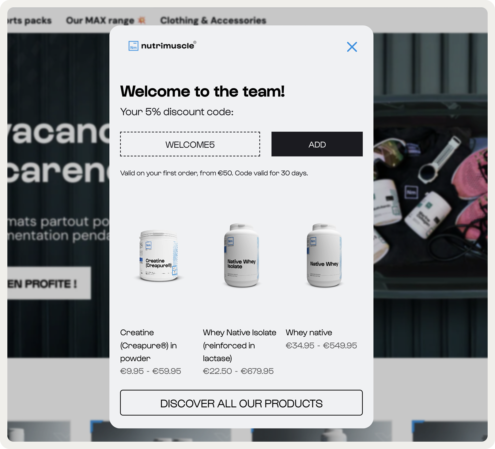
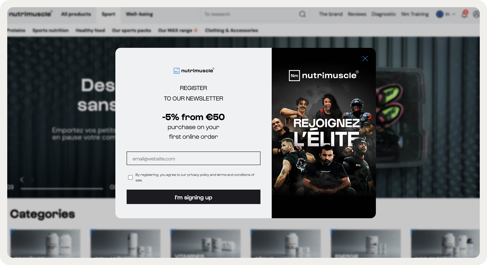
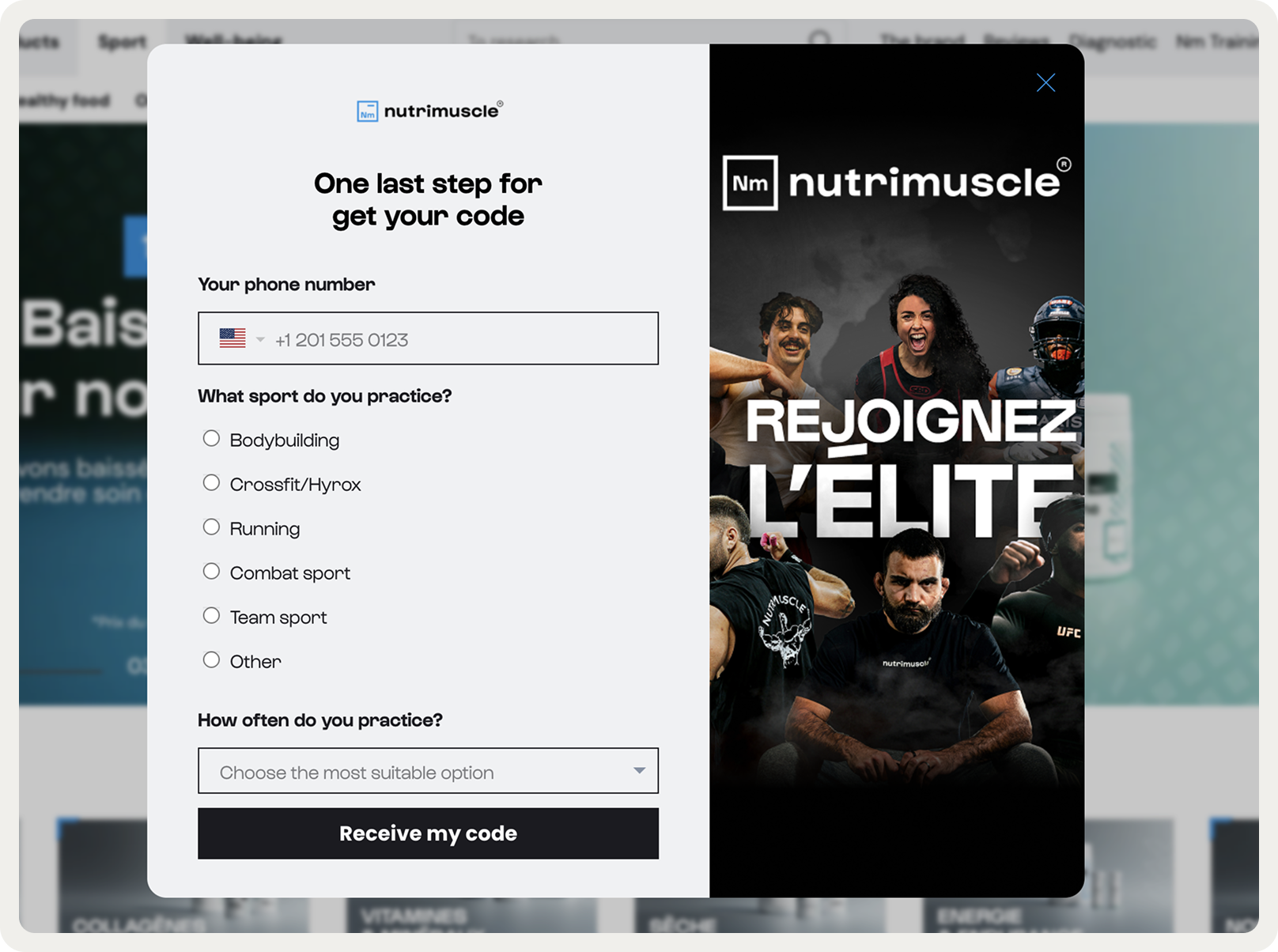
1. Nutrimuscle
Takeaway: Make multi-step popup designs to capture data and reward visitors immediately
Nutrimuscle’s three-step popup shows how thoughtful design can boost engagement. Step 1 collects the email. Step 2 gathers extra info like phone number, sport type, and activity frequency, helping personalize future campaigns. Step 3 gives value: a discount and product recommendations.
It’s a great example of a popup design that balances lead capture, personalization, and conversion without feeling pushy or interruptive.
Here's the flow of the campaign, starting with step 1:
2. Uranus Viper
Takeaway: experiment with campaign placements
Our popup research showed that the bottom-center screen position drives strong results, converting 12.88% of visitors—well above the 4.65% average.
That’s likely why Uranus Viper placed their sleek, visually appealing signup popup there, combining prime placement with clean design to capture attention and drive conversions.

3. Remarkable
Takeaway: Use a large product photo
Although Remarkable’s popup design is a gorgeous example of matching the rest of the website, let’s focus on the formats they’re using. When I visited this website a week ago, I saw this lead capture popup that felt like an extension of their store.

4. California Olive Ranch
Takeaway: Show products in action
This beautiful popup design shows how we can add product animations in a way that engages… and makes us a little bit hungry! Also, note that headline—a good example of going for something else than “sign up for our newsletter.”

5. Silverlake Wine
Takeaway: minimal fits the website perfectly
This good-looking popup form design is a great example of how minimal design can really shine. No images, no graphics, no visuals of any kind. Keep this popup window design in mind in case you want to make a simple, small newsletter form.

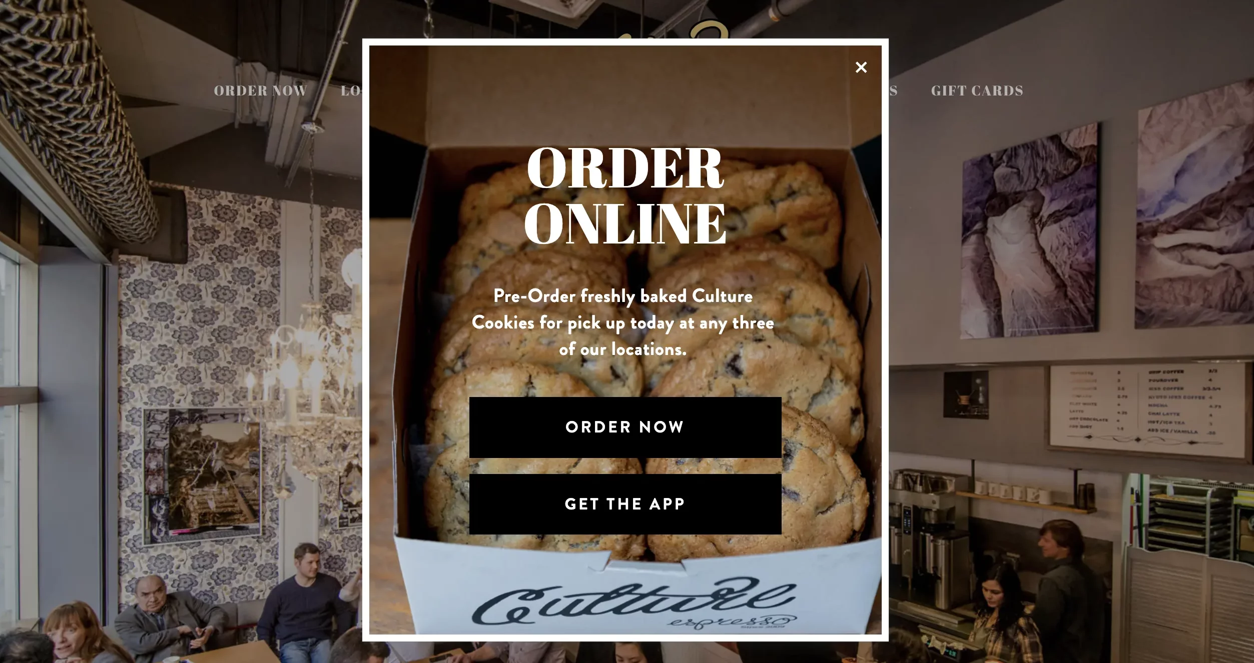
6. Culture Espresso
Takeaway: Collect orders via popups
Culture Espresso, a coffee shop, generates orders with this popup. Note how simple this beautiful design is made: just one product image, two contrasting buttons, and a short, perfectly readable text. And now, the business is promoting their app and gets more orders thanks to that simple popup.
7. Who Gives a Crap
Takeaway: Try a small, cornered format
This toilet paper subscription company (a creative name, wouldn’t you say?) uses a small popup that appears on the side of the screen. This popup design allows visitors to keep exploring the website.

8. FITS
Takeaway: Try minimalistic, black-and-white design
This popup example from FITS is black and white, and has no background visual. The design matches the overall color “feel” of the website, which makes it look natural. The offer is very clear—and that’s what we call a straight-to-the-point website popup design!

9. Highway Robery
Takeaway: design a subtle slide-in popup
Highway Robery, an online store, made a subtle slide-in popup that appears as users scroll down their homepage. This website popup design is non-intrusive and does its job engaging visitors very well—I mean who wouldn’t like to win a free colorful robe, right?
Highway Robery also made our list of the best ecommerce website designs thanks for its creativity—check them out!

10. Nike
Takeaway: Collect data for customer segmentation
Want to collect more info from visitors besides emails? More fields can be a deterrent for visitors. However, you can avoid this by keeping user experience front of mind while designing the popup. Nike’s ecommerce popup design example shows how you can do it effectively.

11. MeUndies
Takeaway: try graphic design, no images
Now, let’s see another colorful popup design. This popup from MeUndies is a great example: it’s attention-grabbing, creative, and engaging. Everything is right in this popup design, from the visual to the color choice, and the CTA that just pops.

12. OddBalls
Takeaway: A well-crafted design can make exit popups both effective and memorable
This cart abandonment popup shows how design can amplify conversion. The bold headline grabs attention instantly, while the live countdown timer adds visual urgency with every passing second.
A bright, playful copy anchors the layout and reinforces the brand’s humor. The coupon code and 10% discount are placed prominently, ensuring the reward is impossible to miss.

13. Soi Paris
Takeaway: Combine cohesive visuals and a minimalist layout make popups feel effortless.
What I like the most about this example is visual harmony. The sand background and blue checkered dress mirror the brand’s lifestyle imagery. Bold typography instantly communicates value, while the clean layout avoids clutter and focuses attention on the offer.
Every design choice—from color palette to typography—reinforces the aspirational French aesthetic, making the popup feel like a natural extension of the brand experience.

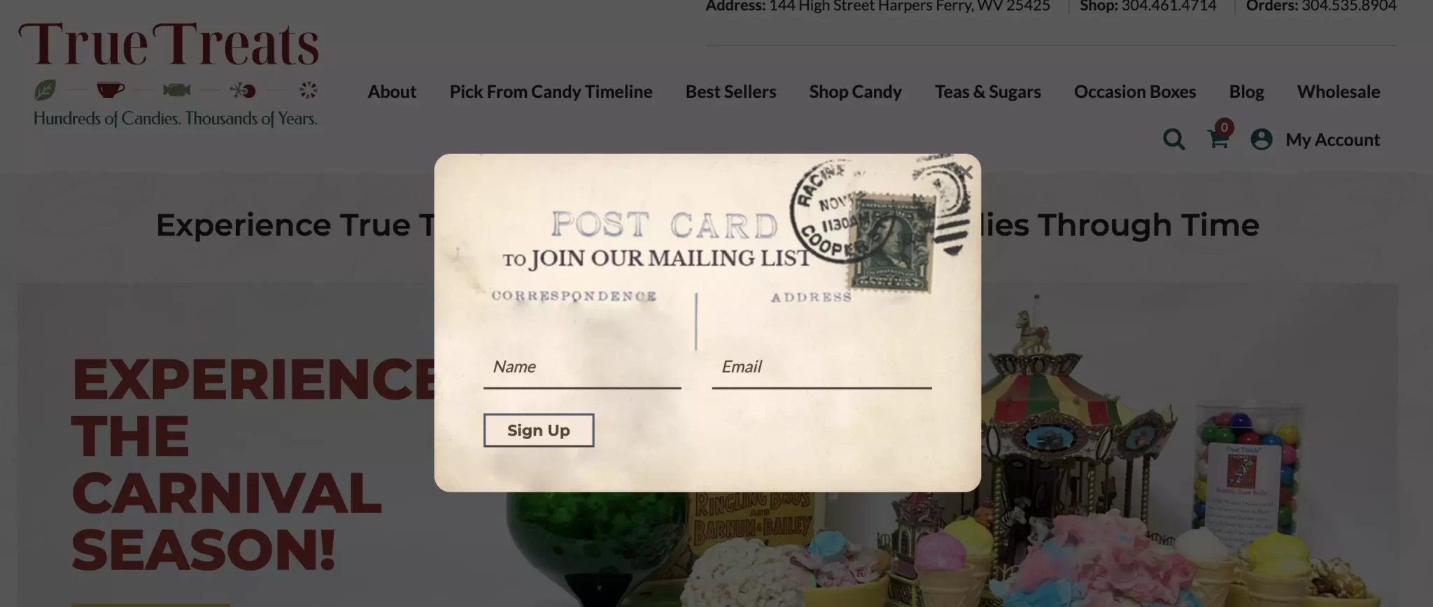
14. True Treats
Takeaway: Take illustrations one step further
You’ve got a postcard! Oh, wait, it’s a newsletter popup with a super creative illustration! Well, when you are a historic candy store like True Treats, then your popup designs should be appropriate. What a cool way to ask people to subscribe to a newsletter!
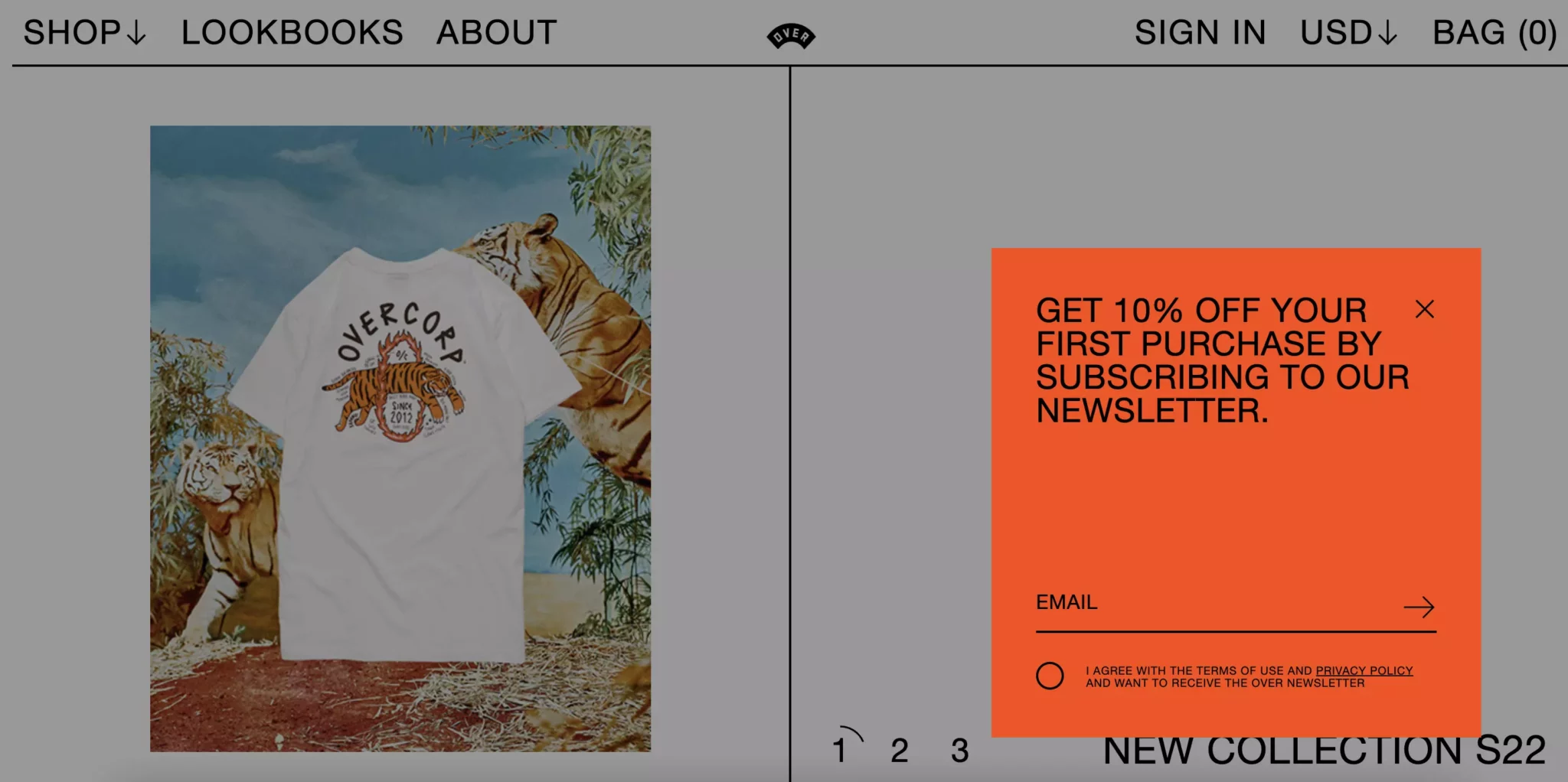
15. OVER
Takeaway: Stand out with bold colors
Here’s another example of a super creative popup design from OVER clothing. The copy is short, and the eye is drawn to the popup thanks to the contrasting red color. Hands down, one of the most unique popup design examples we’ve seen.
16. Carbon 38
Takeaway: Combine two images into one popup design
This popup example goes even further. The round popup (a rare shape in popup design) is highlighted by the model on the right. It’s a full-screen popup, so it captures the attention of visitors effectively.

17. Rouje
Takeaway: showcase lifestyle imagery with split-screen layouts while keeping the conversion path simple
Rouje’s popup blends brand storytelling with conversion-driven design. The split-screen layout pairs aspirational Mediterranean photography on the left with a clean, high-contrast conversion zone on the right. Bold text, a simple email input, and a striking black CTA button create a clear and frictionless path to signup.
Subtle preference checkboxes for Fashion and Beauty add a layer of ecommece personalization without cluttering the layout. The result: a popup that feels stylish, purposeful, and aligned with Rouje’s identity.

18. Taylor Stitch
Takeaway: Use a huge hero image
You’re browsing Taylor Stitch’s website and bam!
You’re standing outside, looking out upon a beautiful mountain range. Okay, that didn’t happen (the folks in the lab are still working on teleportation), but this popup design creates that effect beautifully. The full-screen format and amazing background image is a striking combination.

Popup designs for mobile
In a world where more than half of the traffic is mobile, you need a popup marketing strategy adapted to mobile devices. And with Google’s guidelines regarding mobile interstitials, you can’t just work on making your creations responsive.
19. Patagonia
Takeaway: Keep it simple
Let’s start with the simplest popup example possible: white copy on a black background. Patagonia respects Google guidelines with a welcome popup that is easy to read and close and uses the same color palette.

20. Timberland
Takeaway: Use color selectively
Timberland placed their mobile popup at the bottom of the screen, maximizing the readability of the rest of the website. Also, they added a little more color, while still keeping it in the style of the website.

21. OverstockArt
Takeaway: Highlight the main benefit
This popup design from an art seller combines the signup form and an illustration in a natural way. The contrasting CTA button with “Get 20% off now” encourages visitors to take action; in fact, this campaign was a part of strategy that helped generated over 1,000 emails monthy.

22. Not Pot
Takeaway: Promote "free gift with purchase" items to increase average order value
Full-screen mobile popups are not very common but sometimes necessary if you need to promote an important offer or make an announcement.
In this campaign, Not Pot lets visitors know about their new sister brand, and offer to get a free item with purchases over $49. The design of the popup is simple and to the point.

23. Death Wish Coffee
Takeaway: combine multi-step design with gamification to improve email and phone number capture
This mobile popup design hits a few important best practices:
delayed display: it appeared about 30 seconds after I landed on the website (this timing is known to improve lead generation)
multi-step data capture: using multiple windows in popups reduces perceived commitment and generates high conversion rates
gamification: spin to win wheels, when used ocassionally, can improve email capture rates by 6% on average


24. Halfdays
Takeaway: Use multi-step design to improve engagement
This three-step design shows progressive profiling done right in lead generation popups. This multi-step approach reduces perceived commitment at each stage, which could double signups, as our research found.
Let me walk you through this design:
The first step: uses category selection buttons to segment users by interest. The black buttons on white create clear clickable targets without requiring text input (which is critical at the friction-heavy first step)
The second step: captures email with benefit-focused copy emphasizing "early access" and "community events" rather than just discounts.
The third step: adds SMS opt-in with smart localization and transparent legal copy about message frequency.


25. Timex
Takeaway: Make your mobile layout work through logical visual hierarchy
This popup design balances premium product photography with straightforward conversion design. The watch creates aspirational context while the bold black-and-white typography makes the offer instantly scannable. The rounded input field and full-width CTA follow clean, mobile-friendly design patterns.

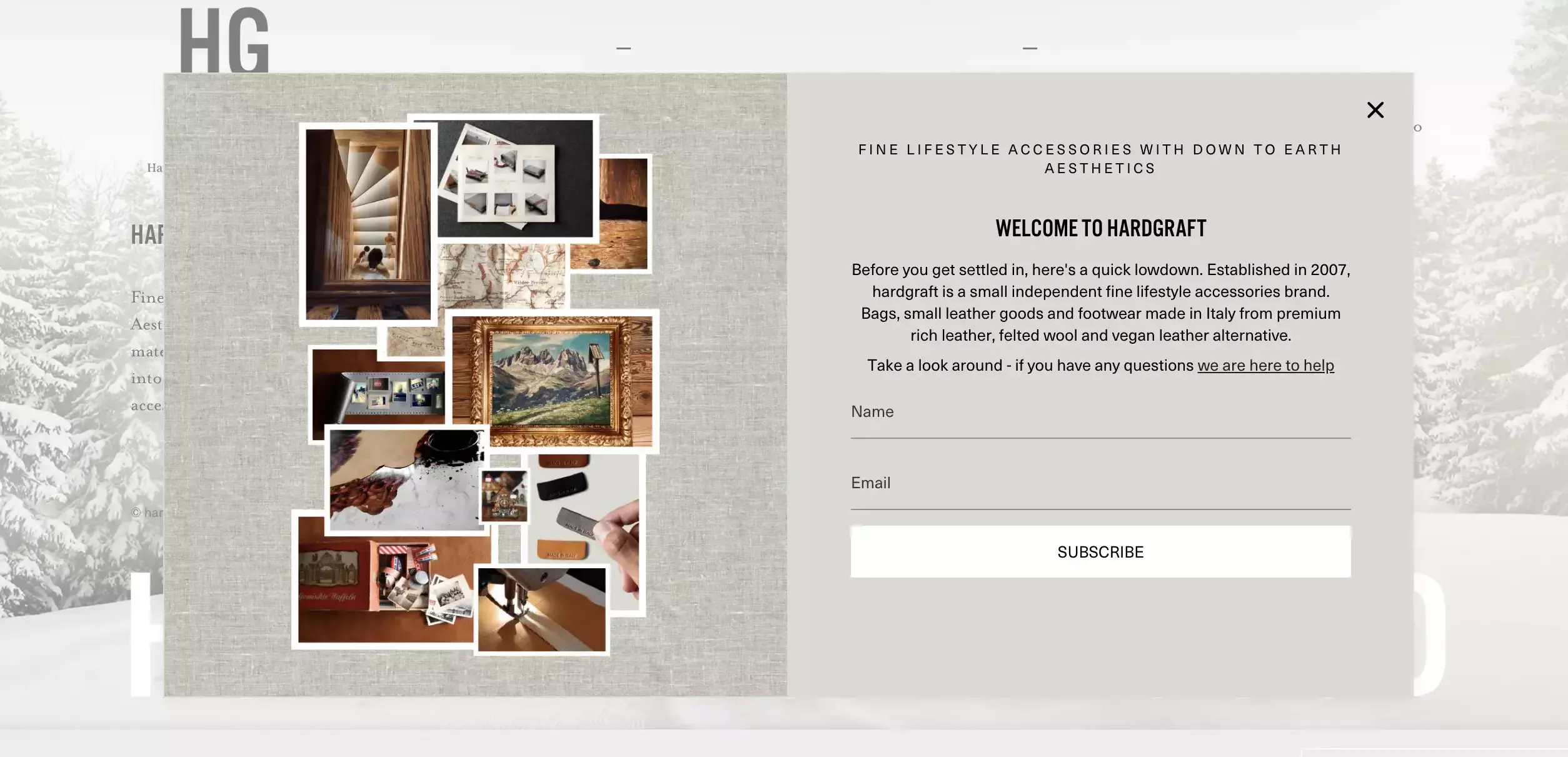
26. Hardgraft
Takeaway: Use honest, slower-paced copy that acknowledges infrequent communication to position email signups as exclusive access rather than promotional
Need popup design ideas for a luxury brand? This is a good one. It uses understated elegance that mirrors their premium leather goods aesthetic of Hardgraft. The muted background and serif typography create a sophisticated, unrushed feel that contrasts with typical popups.
The "2025 New Product Digest" positioning frames email signup as exclusive access rather than a promotional grab. Also, note the subtle privacy acknowledgment below the CTA—that's a way to build trust without legal heaviness.

27. Diaspora
Takeaway: Combine email capture and quiz promotion naturally
This is a great example of a high-converting mobile popup campaign layout that does way more than email capture.
The design fits the website perfectly and shares a copyable discount code, and even asks for visitors’ birthdays to send them special offers. The final step invites them to take a product quiz, helping each visitor find the right items faster.


One last but very important thing about this mobile popup design: the sticky tab.
To make the campaign less intrusive, the brand keeps it accessible with the tab. That means that if the visitor chose to close the campaign the first time, the discount still stays accessible.

Popup design: wrap up
We hope these best popup design examples were interesting and inspiring for you.
Last thing:
Popup design is just one piece of the puzzle. To be as effective as possible, your campaigns need strong copy and a good offer. Together, these elements can make high-performing campaigns that generate leads and conversions.
Feel like creating your first popup design? Sign up for our popup builder to make your first campaign in about ten minutes.
Get started
in minutes
Start converting more visitors today.
Get started in minutes and see results right after.