


Read summarized version with
 ChatGPT
'%3e%3cpath%20fill-rule='evenodd'%20clip-rule='evenodd'%20d='M16.4875%200V6.06H18.75V14.6833H16.3042V20L10.44%2014.8383V19.9592H9.53083V14.8325L3.66%2020V14.6125H1.25V5.99H3.65333V0L9.53083%205.41167V0.158333H10.4392V5.56667L16.4875%200ZM10.44%207.53667V13.6358L15.395%2017.9975V12.0333L10.44%207.53667ZM9.52417%207.47L4.56917%2011.9683V17.9975L9.52417%2013.6358V7.47083V7.47ZM16.3042%2013.7867H17.8408V6.9575H11.2167L16.3042%2011.5742V13.7867ZM8.81917%206.88667H2.15833V13.7158H3.65833V11.5692L8.81833%206.88583L8.81917%206.88667ZM4.5625%202.06333V5.98833H8.825L4.5625%202.06333ZM15.5783%202.06333L11.3158%205.98833H15.5783V2.06333Z'%20fill='black'/%3e%3c/g%3e%3cdefs%3e%3cclipPath%20id='clip0_4212_18220'%3e%3crect%20width='20'%20height='20'%20fill='white'/%3e%3c/clipPath%3e%3c/defs%3e%3c/svg%3e) Perplexity
Perplexity'%3e%3cpath%20d='M9.996%2019.992C9.996%2018.6068%209.73182%2017.3074%209.19632%2016.0936C8.68224%2014.8798%207.96824%2013.8159%207.0686%2012.9163C6.16896%2012.0166%205.11224%2011.3098%203.89844%2010.7957C2.68464%2010.2602%201.38516%209.996%200%209.996C1.38516%209.996%202.68464%209.73896%203.89844%209.21774C5.11224%208.68224%206.1761%207.96824%207.0686%207.0686C7.96824%206.16896%208.6751%205.11224%209.19632%203.89844C9.73182%202.68464%209.996%201.38516%209.996%200C9.996%201.38516%2010.253%202.68464%2010.7743%203.89844C11.3098%205.11224%2012.0238%206.1761%2012.9234%207.0686C13.823%207.96824%2014.8798%208.68224%2016.1007%209.21774C17.3145%209.73182%2018.614%209.996%2019.9991%209.996C18.614%209.996%2017.3145%2010.2602%2016.1007%2010.7957C14.8869%2011.3098%2013.823%2012.0166%2012.9234%2012.9163C12.0238%2013.8159%2011.3098%2014.8726%2010.7743%2016.0936C10.2538%2017.327%209.98905%2018.6533%209.996%2019.992Z'%20fill='url(%23paint0_radial_4212_18233)'/%3e%3c/g%3e%3cdefs%3e%3cradialGradient%20id='paint0_radial_4212_18233'%20cx='0'%20cy='0'%20r='1'%20gradientUnits='userSpaceOnUse'%20gradientTransform='translate(-1.13275%205.96185)%20rotate(18.68)%20scale(21.2772%20170.46)'%3e%3cstop%20offset='0.07'%20stop-color='%239168C0'/%3e%3cstop%20offset='0.34'%20stop-color='%235684D1'/%3e%3cstop%20offset='0.67'%20stop-color='%231BA1E3'/%3e%3c/radialGradient%3e%3cclipPath%20id='clip0_4212_18233'%3e%3crect%20width='20'%20height='19.992'%20fill='white'/%3e%3c/clipPath%3e%3c/defs%3e%3c/svg%3e) Gemini
Gemini'%3e%3cpath%20d='M3.92888%2013.2962L7.86008%2011.0903L7.92585%2010.8981L7.86008%2010.7918H7.66782L7.01009%2010.7513L4.76369%2010.6906L2.81581%2010.6097L0.928632%2010.5085L0.453044%2010.4073L0.0078125%209.82039L0.0533475%209.52694L0.453044%209.25879L1.02476%209.30939L2.28962%209.3954L4.18692%209.52694L5.56309%209.60789L7.60204%209.82039H7.92585L7.97138%209.68884L7.86008%209.60789L7.77407%209.52694L5.811%208.19631L3.68603%206.78978L2.57295%205.98027L1.97088%205.57045L1.66731%205.18593L1.53577%204.34607L2.08219%203.74399L2.81581%203.79459L3.00301%203.84518L3.74674%204.4169L5.33541%205.64634L7.40979%207.1743L7.71335%207.42727L7.83478%207.34126L7.84996%207.28055L7.71335%207.05287L6.5851%205.01391L5.38095%202.93954L4.84465%202.07943L4.70298%201.56337C4.65239%201.35087%204.61697%201.17379%204.61697%200.956236L5.23928%200.111308L5.58332%200L6.41307%200.111308L6.76218%200.414875L7.27824%201.59373L8.11305%203.45054L9.40827%205.97521L9.78773%206.72401L9.9901%207.41715L10.066%207.62965H10.1975V7.50822L10.3038%206.08652L10.5011%204.34101L10.6934%202.09461L10.7591%201.46218L11.0728%200.703263L11.6951%200.293448L12.1808%200.526183L12.5805%201.0979L12.5249%201.46724L12.2871%203.01037L11.8216%205.42879L11.5181%207.04781H11.6951L11.8975%206.84543L12.7171%205.75765L14.0933%204.03744L14.7005%203.35441L15.4088%202.60056L15.8641%202.24134H16.7242L17.3567%203.18239L17.0733%204.15381L16.1879%205.277L15.4543%206.22818L14.4019%207.64483L13.7442%208.77814L13.8049%208.86921L13.9618%208.85403L16.3397%208.34809L17.6248%208.11536L19.1578%207.85226L19.851%208.17607L19.9269%208.50493L19.6537%209.17784L18.0144%209.5826L16.0918%209.96711L13.2282%2010.6451L13.1927%2010.6704L13.2332%2010.721L14.5234%2010.8424L15.0749%2010.8728H16.4257L18.9403%2011.06L19.598%2011.4951L19.9926%2012.0263L19.9269%2012.4311L18.915%2012.9471L17.5489%2012.6233L14.3615%2011.8644L13.2686%2011.5912H13.1168V11.6823L14.0275%2012.5727L15.6972%2014.0804L17.7867%2016.0233L17.893%2016.5039L17.6248%2016.8834L17.3415%2016.8429L15.5049%2015.4617L14.7966%2014.8394L13.1927%2013.4885H13.0865V13.6302L13.4558%2014.1715L15.4088%2017.106L15.51%2018.0066L15.3683%2018.3L14.8624%2018.4771L14.3058%2018.3759L13.1624%2016.7721L11.9835%2014.9658L11.0324%2013.3468L10.916%2013.4126L10.3544%2019.4586L10.0913%2019.7673L9.48416%2020L8.97821%2019.6155L8.71006%2018.9932L8.97821%2017.7637L9.30202%2016.1599L9.56511%2014.8849L9.80291%2013.3013L9.94457%2012.7751L9.93445%2012.7397L9.81808%2012.7549L8.62405%2014.3941L6.80771%2016.848L5.37083%2018.386L5.02679%2018.5226L4.42977%2018.214L4.48542%2017.6625L4.81935%2017.1718L6.80771%2014.642L8.0068%2013.0736L8.7809%2012.168L8.77584%2012.0364H8.7303L3.44824%2015.4667L2.50718%2015.5882L2.10242%2015.2087L2.15302%2014.5864L2.34528%2014.384L3.93394%2013.2912L3.92888%2013.2962Z'%20fill='%23D97757'/%3e%3c/g%3e%3cdefs%3e%3cclipPath%20id='clip0_4212_18270'%3e%3crect%20width='20'%20height='20'%20fill='white'/%3e%3c/clipPath%3e%3c/defs%3e%3c/svg%3e) Claude
Claude'%3e%3cpath%20d='M7.77353%2012.0388L14.278%207.23827C14.5972%207.00347%2015.0534%207.09396%2015.205%207.46044C16.0048%209.38782%2015.6469%2011.7045%2014.0559%2013.296C12.4648%2014.8862%2010.2512%2015.2348%208.22684%2014.4407L6.01614%2015.4643C9.18686%2017.631%2013.0375%2017.0949%2015.4431%2014.6885C17.3517%2012.7811%2017.9424%2010.1807%2017.3896%207.83507L17.3941%207.83956C16.5927%204.39408%2017.5906%203.01744%2019.6366%200.202196C19.6839%200.135341%2019.7332%200.0676703%2019.7821%200L17.0908%202.6901V2.68113L7.7719%2012.04M6.43072%2013.2047C4.15521%2011.0323%204.54778%207.66916%206.48861%205.72874C7.92395%204.29299%2010.2773%203.7076%2012.3307%204.56815L14.5369%203.55024C14.1398%203.26326%2013.6303%202.95507%2013.0453%202.73738C10.4045%201.65058%207.24114%202.19113%205.09403%204.3362C3.02927%206.40055%202.37948%209.57493%203.49441%2012.2838C4.32765%2014.3078%202.9616%2015.7407%201.58578%2017.185C1.097%2017.6966%200.609043%2018.2098%200.214844%2018.752L6.42787%2013.2047'%20fill='black'/%3e%3c/g%3e%3cdefs%3e%3cclipPath%20id='clip0_4212_18265'%3e%3crect%20width='20'%20height='18.752'%20fill='white'/%3e%3c/clipPath%3e%3c/defs%3e%3c/svg%3e) Grok
GrokCall them whatever you like: email popups, newsletter popups or email signup popups.
They work wonders.
Wonders like getting you 20K emails and converting 10% of visitors.
But—
Creating your first email popup can be a little daunting.
That's why we’ve compiled these email popup examples to inspire and guide you.
Go to sections:
Set up professional email popups in 30 minutes
Choose from 150+ email popup templates, customize in minutes, and start growing your list with high-performing designs.
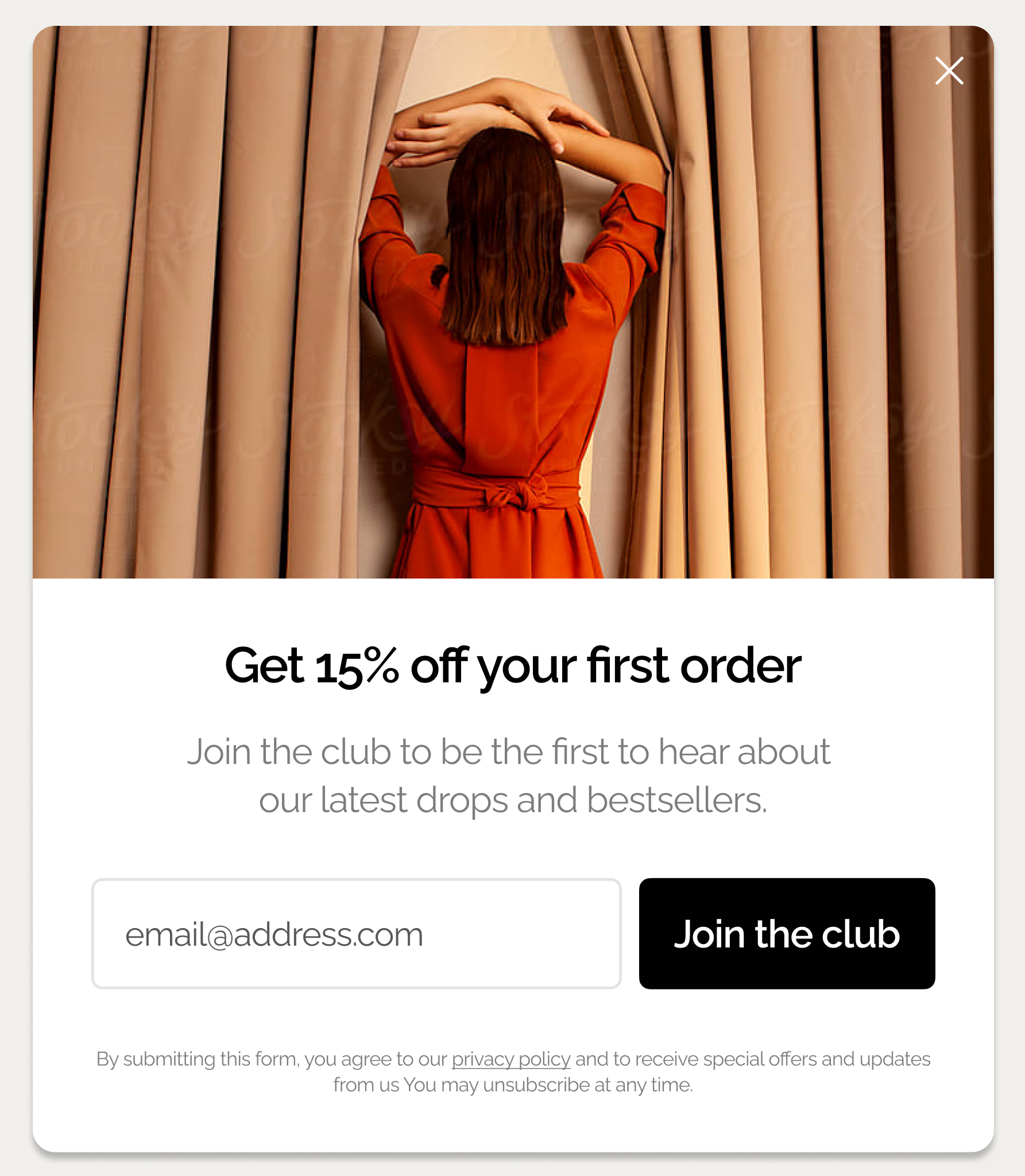
What's an email popup?
An email popup is a website popup designed specifically to collect email addresses through a signup form. The goal is to generate leads on desktop and mobile by capturing visitor emails in exchange for incentives such as discounts, free shipping, or content, converting visitors into prospects.
To maximize conversions, online businesses display email popups at key moments like a first website visit, exit intent, or after visiting a specific product to keep them relevant for visitors. This practice helps increase sign-up rates while minimizing disruption to the browsing experience.

Facts about email popups:
Email popups convert 4.65% of visitors on average, but top-performing campaigns reach even 19.77%
Email popups can also ask for visitors' phone numbers, gender, product preferences (e.g. men's or women's), and content preferences thanks to the multi-step format
Email popups with one signup field (like the example above) convert 5.77% visitors on average because they make it easy to subscribe
Email popup playbook
This playbook breaks down the highest-performing email popup campaigns we see ecommerce brands using today. Click the popups below to see how they work.

Email & SMS
Turn new visitors into subscribers and collect their emails + phone numbers

Welcome Offer for New Visitors
Turn new visitors into leads with an instant discount + social proof

Spin to Win Popup
Gamify email capture with a prize wheel
How effective are email popups?
Email popups convert 4.65% of visitors on average, according the 2025 Wisepops study of 1.1+ billion email popup displays.
Here is the full study results, broken down by designs, types, and triggers of email popups:

How to create an email popup using best practices
An email popup could have these essential elements:
Heading. Describe the benefit of subscribing (discount, content, etc.)
Subheading. Give more details about the benefits (better deals, early access, etc.)
Branding elements. Add your brand's name or an image with a logo; use your unique color palette
Email input field. This element is added to email popup templates on default
Phone number input field. You can also add this element to collect phone numbers
Name input field. This is where the visitor enters their name you can use to personalize emails
CTA button. Also present by default, visitors click this button to subscribe
Closing option. This could be a text like "No thanks" or a closing button (or you can have both)
Image. Add a unique lifestyle image of a product or service you're offering to motivate visitors to sign up

Here's how to make an email popup:
Use for free for 14 days, no cc needed. See campaign ideas you can launch today

You can also see examples of how other websites like...
telecommunication companies use email popups.
For detailed step-by-step instructions and tips on creating email popup campaigns, watch this quick video:
More popup types to explore:
Email popup examples from ecommerce
Let’s start with popups used by online stores and retailers.
Nutrimuscle
This email popup offers a discount for first-time customers. The design includes a cool image with the brand's ambassadors, which invites to "join the elite squad."

The campaign also has a two-step signup flow, which allows it to capture both emails and phone numbers. Here's the second step, along with a quick survey:

When visitors clicks to go to the next step, they'll get the discount code (below). What's really great here is that this email popup also features some product recommendations to encourage them to browse right away.
Having multiple steps, an incentive, a survey, and product recommendations is what makes this email popup effective for improving lead generation and sales. In fact, this email popup is a part of the visitor conversion strategy that generated over 7K leads.

Oddballs
This email popup example takes a different approach: gamification (the visitors spin the wheel to get discounts). CVR of spin-to-win email popups like this one is 125% higher compared to the traditional format, making this design one of the most effective.
Indeed, over 3K emails were collected by this campaign.
OddBalls also adapted the email popup for mobile (shown on the right). In the mobile version, the image was removed to improve readability and make the spin wheel easier to use.

The "Spin to Win" campaigns not only grew our list but also generated immediate sales and positive brand engagement. By gamifying email capture and promotions, we transformed routine processes into delightful interactions that drove real results. These insights will shape our future marketing strategies, encouraging us to explore more interactive ways to connect with our audience. We're excited to continue innovating and engaging with our customers in fun, on-brand ways.

OddBalls
Nature's Fynd
Nature's Fynd calls itself "a food company for optimists." Indeed, their positive spirit shines through in this creative email popup on their homepage. Gorgeous!

Heatonist
This email popup is an awesome example of how you can collect emails on your website with product announcements. Want to be the first to know? Just sign up.

King Arthur Bakery
Want to try a product image to your newsletter popup? Try darkening it a bit and then adding as the background. That's what this email popup example does, and it's just amazing.

Blume
This is a simple email capture popup that appears on the homepage to new visitors. It promotes a brand birthday weekend sale.
The copy builds anticipation and the beautiful image shows some of the products customers can buy with the discount, which is a great tactic to boost conversion rates.
In fact, this email popup converts 5% of visitors on Blume, which is higher than the average popup conversion rate.

What to share in your newsletter signup popups:
Dolce & Gabbana
This newsletter popup example from D&G contains four input fields (it's the second best number that converts 4.60% on average). Yet its stripped-down design makes it look as if it is only asking for your email address.

The Frankie Shop
Let’s switch to a black and white design.
This email signup popup’s minimalistic design and position in the bottom right corner make it visible but not intrusive. I can tell you from experience that this balance is difficult to reach!

DB Journey
This lightbox popup includes a beautiful background glow which makes it more impactful. Elegant and efficient—a reflection of both the DB Black's Scandinavian roots and design style.

Dock & Bay
Dock & Bay uses an email signup popup that offers 15% off when they buy two or more items. The design keeps it simple with a single email field, making the incentive clear and the signup process quick.
This type of popup works well in ecommerce to drive both list growth and higher average order value by tying the discount to multi-item purchases.

Sunbasket
This email popup example comes from a meal delivery service. For companies like this, showing off some products makes total sense. That’s why there’s a picture of a delicious meal included—a great idea to get potential customers interested.

Rouje
Rouje's website is elegant and sleek, and their newsletter popup campaign follows the same design. What makes it stand out is that visitors can choose a product category they’re interested in, which helps personalize future email campaigns.

Nkuku
Nkuku’s email popup features a lifestyle image of a dining table set with their dinnerware on the right, while the left side contains two signup fields for name and email. The incentive is clear: subscribers get the discount and the chance to win a voucher, combining visual appeal with a strong reason to sign up.

More examples by format:
Gaiam
This unusual shape catches visitors’ attention instantly and aligns with the brand’s visual aesthetic. The classic “Stay in the know” is powerful as well: nothing works better than suggesting that your visitors might be missing out on something.

Highway Robery
Highway Robery is positioning their newsletter popup on the right side of the screen. They’re probably assuming that users tend to scan their page in a Z shape. Proponents of this UX theory say that the bottom right corner of the screen is most likely to drive action.

Uranus Viper
The latest popup research suggests that the “bottom center” of the screen position is one of the most effective, converting to 12.88% visitors (which is way higher than the average 4.65%).
That may be one of the reasons Uranus Viper chose this position for their good-looking signup popup campaign:

Ulta
After lightbox popups and side popups, it’s time to check out some email sticky bars!
This one from Ulta ranks high on my personal list. Bright colors, eye-catching call-to-action, excellent position — you can’t beat it!

Recess
This email popup bar features two signup fields: for the first name and email. It's made to complement the overall design of this ecommerce website beautifully and is located at the bottom of the screen—so you won't miss it.

Gwen Beloti
This elegant email popup is perfectly in line with the brand’s visual style. An elegant design, a short copy, and brand's colors make the popup appear natural on the website.

Squat Racks Canada
This email popup is a nice example of using contrasting colors to attract attention. The color red generates a sense of urgency, which is a perfect technique to build an email list by having visitors sign up for a timed promotion.

Woven Store
This newsletter popup gets the message across quickly, which is a must to engage potential subscribers. The use of playful fonts makes the popup even more visually appealing.

Restated Vintage
A large, striking visual is the most prominent feature of this email popup. We’re visual creatures, so many visitors of Restated Vintage will be drawn to this aspirational image. A 10% discount and first access to deals will seal the deal.

B2B and SaaS email popup examples
Sure, e-commerce email popups are interesting. But it’s worth reviewing some B2B examples as well!
Sitepoint
Let’s start with a classic lead magnet. Sitepoint offers new subscribers a free book in this email popup example. Of course, it’s an e-book, but the content is highly valuable to Sitepoint visitors.
The book also looks very professional (it follows the best practices for this kind of media). And the traditional book shape makes it more valuable (yes, readers prefer paper books). Besides, the topic appeals to the target visitors.

Gong.io
This email signup popup is simple. But the copy is very strong.
Gong’s team relied on two versions of the same marketing technique: social proof.
In the headline, they suggest that a lot of users have already joined the list (Wisdom of the crowd effect) while the body relies on Expert social proof. Who wouldn’t like to join employees from Linkedin and SalesLoft?

Yespark
This email popup is a part of Yespark's strategy to get more people to use their parking solution. There's also a discount for the first monthly parking, which is a nice added bonus.
Yespark displayed this campaign to new visitors only and generated 3,494 emails.

OpenView
When preparing this selection, we reviewed thousands of newsletter popups. But we haven’t found any with a stronger headline than this one. So engaging!

Chanty
This email capture campaign from Chanty is simply stunning.
Using animation in a popup is a great idea. But using a Matrix-inspired animation—that’s just awesome. One of the most creative email popup examples we’ve seen, hands down.

Iterable
When you don’t want to interrupt your visitors during their navigation, your best option is a smaller popup displayed on the side or at the bottom of the page. Most B2B blogs use this format and position for signup forms to capture emails while letting visitors browse the blog uninterrupted.
This example from Iterable’s blog demonstrates this approach.

Orbit Media
I stumbled upon this example on the Orbit Media's blog. As they use an email bar, the content is still accessible, and yet the invitation to subscribe is very visible. Nicely done.

Wix
Taken from Wix’s blog, this campaign is also an email bar. But it goes a step further with contrasting colors that make the bar unmissable. Built using a three-column layout, it’s also easier to read.

Email popup examples from media & blogs
After reviewing B2B and ecommerce popups, I wanted to include some examples taken from media websites. Why? Because most media rely heavily on newsletters to drive traffic. They desperately need to collect emails to survive. As a result, campaigns in this industry are often very creative.
The New Yorker
Let’s start with one of the most respected newspapers—the New Yorker.
Their email popup design is straight-to-the-point: no visual, no fancy illustration. The only colored element is the call-to-action, to drive users to subscribe. The dismiss button is much less enticing.

Mic
This targeting strategy is very interesting: the popup varies, depending on the page you’re reading. I saw this one when I was about to leave an article about food.
The full-screen design is also visually appealing (and a bit impressive) and eye-catching.

Digiday
Yet another black and white popup. The headline is catchy and simple. Yet the call-to-actions, especially “I’m not interested,” make visitors think twice before they close the modal.
The brand also features their logo to clarify that the popup is not an ad.

Emailmonday
Three elements of this subscription popup form caught my attention:
Picture of Jordie, the webmaster, establishes trust
Friendly introduction (“Hi there”) establishes a friendly rapport
Unusual shape of this popup surprises visitors and captures attention

Fast Company
Here we have the combination of an unusual round shape, bright colors that catch the eye, and a cool headline. Again, the popup features the media’s logo to distinguish the popup from an ad.

Really Good Emails
Really Good Email’s newsletter subscription popup is honest and fun. And it shows they know their audience.. If the headline is funny, the sub-heading is more classic and states the benefits of signing up.
The call-to-action is in the same fun tone as the headline and invites visitors to subscribe.

Email popup examples on mobile
Now, let’s finish this list with mobile popups.
If you want to create your own, we recommend you check the best practices for mobile popups.
But first, let’s get you inspired.
Master & Dynamic
This email newsletter displays super well on mobile phones.
The best part? It’s responsive. If you visit their desktop website, you’ll get the same email subscription popup.

Soylent
This email popup kinda looks like a desktop one, right? Yet, it's very easy to read and close. Love how the brand reinforces their mission in the headline here.

Brooklinen
This email popup from Brooklinen makes the most of the limited space that’s available. See how they listed all the benefits?
The colors are also great: subtle and on-brand.
Finally, they took into account the users who might want to close this email popup: the campaign features two closing options that are easy to click.

Timberland
This selection would be incomplete without a call-to-action email popup. Timberland displays a tempting “Join” call to action. When the user clicks, the full message is displayed—a smart way to play on visitors’ curiosity.

Email popups: summary and FAQ
Here you go, 40+ brilliant email popup examples from different industries. When used right, they can generate a lot of emails for you.
So, give them a try!
Email Popup FAQ
What are the best email popup examples?
Welcome popups and spin-to-win gamified popups perform exceptionally well. Match your popup type to the visitor moment—new customer discounts, product recommendations, or last-chance deals. Exit-intent popups, surprisingly have a pretty low average conversion rate of less than 3%.
How do you grow an email list without bouncing visitors?
Delayed popups (20–50 seconds) reduce bounce up to 45% while increasing email capture 20–43%. Avoid immediate popups, which bounce visitors up to 5x. Simplifying your first form—asking just for email—boosts leads 2–3x. Use micro-commitment steps (yes/no) before requesting full details.
Which popup design converts best for emails?
Some findings to consider:
Full-screen popups increase email capture 48% and click-through rates 52% on average
Single-field forms convert best at 5.77%
Multi-step formats drive 8–9x more interactions and double signups while keeping bounce stable.
Four-field forms still convert at 4.60%, proving you can ask for more with the right flow including micro commitment (yes/no).
What copy makes email popups convert higher?
Quantified value copy beats emotional language in 68% of our popup A/B tests and drives 8–15% more revenue. Concise numeric discounts (like "DISCOUNT10") boost engagement 7–20%. Benefit-focused headlines outperform urgency-heavy copy in 70% of tests with 15% more engagement. Skip "Oh no you're leaving!" and go straight for "Get 15% off."
What timing triggers maximize email signups?
Display popups after 20–50 seconds after arriving or after one page viewed. The one-page delay trigger dominates at 28.98% CVR. Exit-intent triggers work at 2.81% CVR, while on-click trigger achieves 28.79%.
How many form fields should a email popup have?
There are no universal rules for a perfect number of fields. Our ecommerce popup research suggests that single-field popups convert best at 5.77%. Two fields drop to 2.65%, but four fields surprisingly recover to 4.60%. People resist commitment upfront—simplified first steps can boost lead capture by 2–3x without significantly increasing bounce.
What's the best approach for mobile email popups?
Over 50% of top Shopify stores use mobile-only popups. Remove background images for clarity (popup builders often allow to choose to hide some popup components on mobile). Use larger, easier-to-tap buttons. Also, consider using a sticky tab that reveals the full popup on tap.
Sources:
Get started
in minutes
Start converting more visitors today.
Get started in minutes and see results right after.