What is a Lightbox Popup? Examples & How to Make
Here to learn about lightbox popups? Great.
Many think that lightbox popups are just good for capturing email addresses, but they could be much more useful. Ecommerce websites use them to show messages like notifications, sale promotions, signup forms, discounts, or announcements.
Click to go to sections:
Easily create lightbox popups for your website
Engage your visitors with personalized popups that achieve conversion rates of up to 25%
If you'd like to make a lightbox popup for your Shopify, Wix, or WordPress website, check out these guides:
What is a lightbox popup?
A lightbox popup is a popup overlay that appears on top of the web page’s content while the rest of the website is inactivated and/or dimmed out. As such, lightbox popups focus the attention on the message rather than the rest of the content.
Running a B2B business?
Get inspiration: 10+ B2B popup examples and ideas
Best practices for lightbox popups
To achieve your goals such as email list building or increasing sales, consider these practices:
Add a discount: see 20 discount and coupon ideas for you
Make it stunning: these 25 popup design examples from ecommerce and B2B businesses will help
Add a countdown timer: creating a countdown timer popup will help you to generate a sense of urgency
Recover abandoned carts: increase sales by having a cart abandonment popup give some extra encouragement to complete the purchase
Create a personalized offer if you're on Shopify: do so with native Shopify visitor targeting properties like cart value and number of orders made
Choose which visitor category to show your lightbox to: here are typical page and audience targeting settings
A/B test your campaign to improve performance: A/B testing for popups is a proven way to find ways to achieve better results
Lightbox popup templates
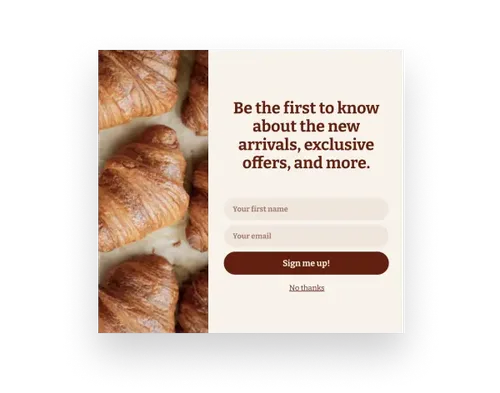
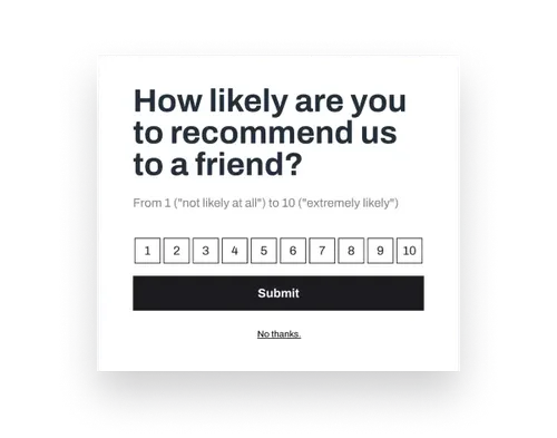
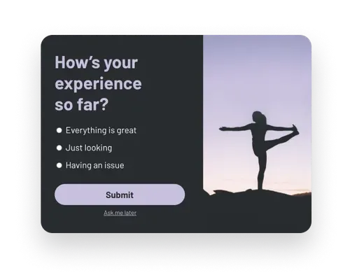
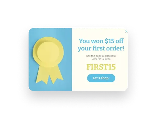
Click these templates to see lightbox popups in action:
A lightbox vs a traditional popup: what’s the difference?
Lightbox popups got their name mainly because of the way they are enabled.
A “lightbox” is a UX effect that happens when you click to enlarge an image on a web page: the background is dimmed and the image comes into focus. In terms of popups, that means that the popup box “lights up” while the background gets darker.
The traditional popup can be called “nonlightbox,” as they don't have this effect.
So—
Lightbox popups on websites are popups whose background is blurred. Simple as that.
This background effect, indeed, can look really cool, so many websites use lightbox popups. If you want to have one, too, check out the next section.
How to create a lightbox popup
I’ll be using Wisepops, a popup builder rated 4.9 stars on Capterra, for this tutorial (here’s 20 ideas to use Wisepops to show you what campaigns others make with it).
To create a lightbox popup:
Create a new campaign
Customize the design
Add the lightbox effect
Get a free account to begin:
14-day free trial, no cc needed.
If you prefer video instructions, this one will help:
Once in Wisepops dashboard—
Click Popups > New popup campaign:
Next—
Choose a template for your campaign:
Next—
Customize your lightbox popup: add your text, image, and colors.
Note that your lightbox popup might also have a sticky tab—a small window in the bottom left corner of the website: learn about sticky tabs.
Next—
We need to dim the background.
To do that, go to Design > Style and click Overlay button to choose how dimmed you want the background to be. Make sure the Use Overlay toggle is on to view this button.
To see how your lightbox popup looks like, add your website in Display Rules > Pages and use the Preview button.
If you’d like more tutorials, please see:
Lightbox popup examples
Let's now see some examples of lightbox popups.
1. Email lightbox popup (Talulah)
This first lightbox popup example comes from Talulah, a successful Shopify store, where this pop-up form is used to grow their email list. The background lights are dimmed almost to the maximum which makes the popup highly visible in contrast.
2. Multistep lightbox popup (New Era)
Used as a multi-step popup, this lightbox popup example asks a question before offering a discount. Such conversational campaigns are often perceived as more visitor-friendly.
3. Newsletter lightbox popup (Not Pot)
You don’t have to dim the dim or blur of your popup completely to achieve the lightbox effect. In this example, we can still see the website, and that’s deliberate: this creative popup is a perfect extension of the website.
4. Video lightbox popup (Exito)
Exito wanted to display a video for Día de la Madre (Mothers’ Day) on their website. To make sure no visitor missed their campaign, they triggered their lightbox popup on landing (it appeared right away when users landed on the website).
5. Mobile lightbox popup (Tom Ford)
Did you think lightbox popups didn’t exist on mobile? If so, this example will change your mind. This mobile lightbox popup example is optimized for viewing on small screens and asks visitors to sign up for a newsletter.
Related:
6. Upsell Lightbox popup (GORP)
With this kind of lightbox popup, you can employ a very effective sales technique: upselling. It’s a great way to persuade shoppers to add more to their order. Below, you can see how GORP Clean Energy Bars uses an upsell popup to entice customers to add more to their order so they’ll get free shipping.
7. Email newsletter lightbox popup (Koffee Kult)
This example of a lightbox popup comes from a coffee shop. It’s a great one because of two reasons. One: its super clear and benefit-focused headline (“Want 15% off?”) and two: the stunning product image.
8. Lightbox popup with a mystery discount (Olive Your Heart)
Lightbox popups don’t have to be light—this one, for example, looks gorgeous! And it’s an interesting one, too: the website offers visitors a time-limited deal.

Learn how Springly, a nonprofit software, uses popups to speed up email list building by 50%:
Summary
Lightbox popups are an effective and good-looking way to engage your visitors. I hope these best practices and examples have inspired you to try them to achieve your marketing goals.

Pawel Lawrowski
Pawel is the Head of Growth at Wisepops and an expert in lead generation, popups, ecommerce, and onsite marketing.
With over a decade of experience in digital marketing and ecommerce, he has both build marketing teams from scratch and led strategic business growth projects.
Pawel has worked with countless online businesses on marketing strategies and is now sharing his knowledge. Previously, he was an head of growth at Tidio, where his responsibilities ranged from creating marketing materials to building acquisition channels.
Education
West Pomeranian University of Technology
Certifications
Marketing Strategy (course)
Advanced Growth Strategy (course)
Retention & Engagement (course)


