Popup Message: 10+ Examples & Tips for Max Engagement

Read summarized version with
A popup message can be nothing more than an ignored disruption.
But—
It can also be a great conversion opportunity when done right.
Here, we're going to show you how to make that happen.
In this guide, we'll give you examples of great popup messages from successful businesses as well as practical tips on how you can achieve your conversion goals.
Go to sections:
Customize, publish, and track revenue and leads
Install in one click and launch email capture, cart recovery, and upsell popups with AI product recommendations.


Need to write a greeting message for your popup? This guide to making welcome messages for customers will help.
What is a popup message?
A popup message is a text within a popup window that communicates a marketing or informational message to visitors. Popup messages can vary but typically consist of a heading, a supporting text with more details, and a text within a CTA button.


Typical popup messages
Feel free to copy and improve these messages for your own campaigns:
Campaign goal
Typical popup message
Capture newsletter subscribers
Join our list! Get the latest trends, updates, and exclusive deals straight to your inbox. Subscribe now and enjoy a 10% discount on your next purchase!
Increase sales with a discount
Welcome to [brand name]! As a first-time shopper, you get 15% off your first order when you sign up!
Recover abandoned carts
Don’t Leave Just Yet! There's only one step left. Complete your purchase now and secure a special 5% off.
Get more orders during sales
Flash Sale Alert! Time is ticking... Grab your favorite items at a 20% discount! This exclusive offer ends in X hours!
Get more loyalty program signups
Premium Perks Await! Join our customer loyalty club and enjoy early access to new releases, members-only discounts, and more!
Increase average order value with free shipping
Say Goodbye to Shipping Fees! Place an order over [X] amount and we'll take care of the shipping cost.
Promote a limited edition product
Exclusive! Get your hands on our limited edition [Product name] before it's gone.
Get visitor feedback with a survey
We Value Your Thoughts! Share your shopping experience with us in a one-minute survey. Your feedback helps us improve!
Case study
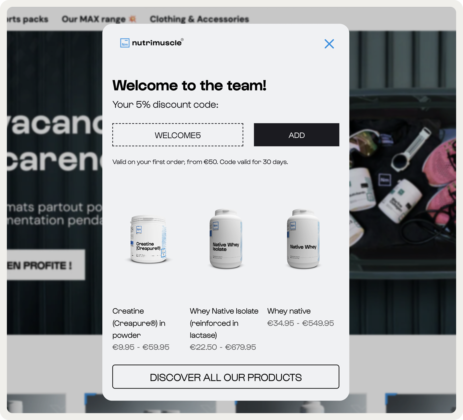
See Nutrimuscle's popup strategy that helped improve sales, visitor engagemet, and cart recovery rate.

Popup playbook
This playbook breaks down the highest-performing popup campaigns we see ecommerce brands using today. Click them to see how they work.

Email & SMS
Turn new visitors into subscribers and collect their emails + phone numbers

Discount Survey
Engage users with a survey that offers a discount as a reward

Book a demo
Highlight any promotional offers or demos prominently for B2B
High-converting popup messaging: insights from 1.8M visitor sessions
In our popup personalization study, we found that several message tactics worked consistently well. While not universal rules, they’re strong best practices to use as a foundation for your popup messaging.
Message tactic
Quantitative impact
Example message
Quantified value copy (vs emotive)
Won in 68% of A/B popup tests / Revenue +8–15%
“Save 15% on your first order” → instead of “Treat yourself today”
Numeric discount codes
Engagement +7–20% • Recovered 8–14% of abandoning shoppers
“Use code SAVE10 at checkout” → instead of “Get a little something for joining”
Neutral or benefit-focused headlines
Beat urgency-heavy ones in 70% of tests • Engagement +15%
“Enjoy 10% off today” → instead of “Hurry! Sale ends soon!”
Exit-intent numeric discount vs empathic text
+27% more clicks
“10% OFF your cart before you go” → instead of “Oh no, don’t leave yet…”
Simplified first step (text-only / fewer fields)
2–3× more leads, no bounce increase
“Want 10% off? Enter your email.” → one field only
Micro-commitment message (Yes/No)
8–9× more interactions, 2× more signups
“Would you like 10% off your first order?” [Yes/No]
Overall tone: short, numeric, benefit-led
Consistently higher visitor engagement and conversions
“Free shipping on your first order” → instead of “We’d love to give you something special”
Want to A/B test your popup messaging?
Start by testing a numeric discount vs empathic copy. Wisepops data shows that numeric discounts improve engagement recover more abandoning mobile shoppers. Test timing (20–50s delay vs immediate) and placement (centered vs cornered) to see what performs best.
Learn more about A/B testing popups.


Popup message examples
Let's now take a look at these popup messages from online businesses.
1. Vepsäläinen: a welcome popup message
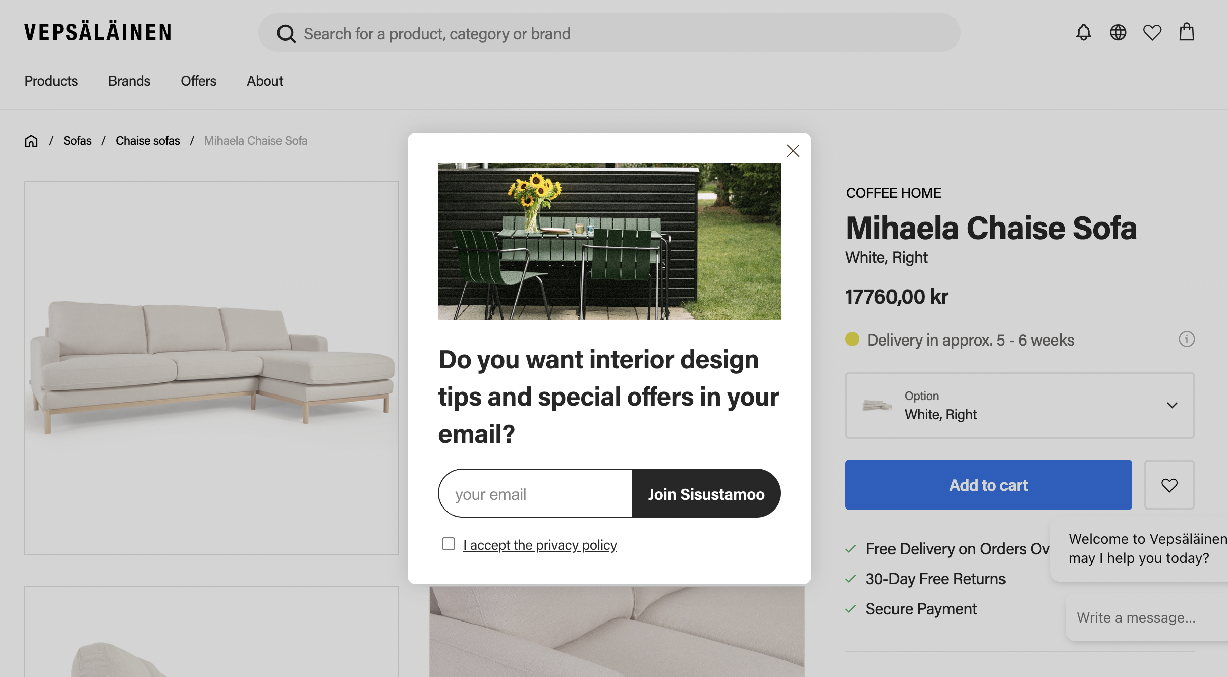

This simple and to-the-point popup message example comes from Vepsäläinen, an online furniture retailer. It appears as a small, non-intrusive window after a few page views.
Best practices from this popup message example:
Clear and concise headline that asks a message
Colorful exterior image supports the message
Action-oriented CTA button text
Become an expert on converting new visitors with popups:
2. Sud Express: An exit intent popup message
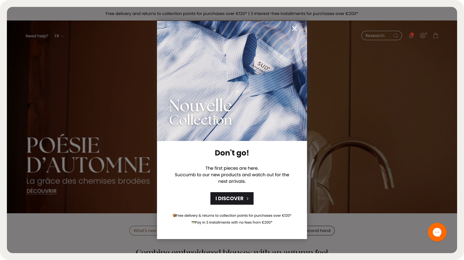

This popup message from Sud Express works because it creates urgency around fresh inventory while keeping the tone conversational and friendly. The headline "Don't go!" feels personal, like the brand is speaking directly to the visitor about to leave. The supporting text explains what they're missing without being pushy.
Best practices from this popup message:
Use casual, relatable language that mirrors how real people talk
Focus on what's new rather than what's being sold
Create soft urgency through novelty appeal instead of aggressive sales tactics
3. Atelier d'Amaya: a notification message


This popup message from Atelier D'amaya combines practical guidance with emotional incentive. The message acknowledges the visitor's need to update their account while framing it as a step toward a reward ("gift on the big day").
Best practices from this popup message:
The tone is warm and helpful, making the action feel like a win rather than a task
Connect account requirements to tangible benefits the visitor cares about
Use celebratory language that makes taking action feel rewarding
See how other businesses capture emails and phone numbers with exit campaigns:
4. DB Journey: urgency-based popup message


DB Journey uses scarcity and exclusivity through countdown mechanics and specific Black Friday sale details. The copy balances urgency with personality—acknowledging that visitors have already seen other sales while making this deal feel like a last-chance opportunity. The countdown timer amplifies the psychological pressure without the message feeling desperate.
Best practices from this popup message:
Combine visual urgency (countdown timer) with concrete deal details
Acknowledge competing sales while positioning yours as the final opportunity
Use conversational language to humanize urgency and avoid sounding spammy
More examples:
5. Blume: a discount popup message
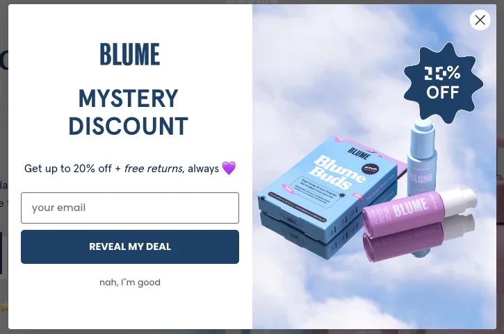

An enticing popup message combined with a cool design makes this campaign hard to resist. In fact, Blume converts 5% of its visitors with this popup, which is higher than the average popup conversion rate of 4%.
Best practices from this popup message:
Grabs the attention of the visitor with an enticing headline "Mystery discount"
Adds even more benefits to the deal in the supporting text (free returns)
Includes an image that enhances the appeal of the offer, as it showcases the products available to the visitor when they take advantage of the deal.
Want to convert more of your visitors with discounts?
Grab these 20 discount code ideas and see how to create a discount popup
6. CODAGE Paris: a special offer popup message
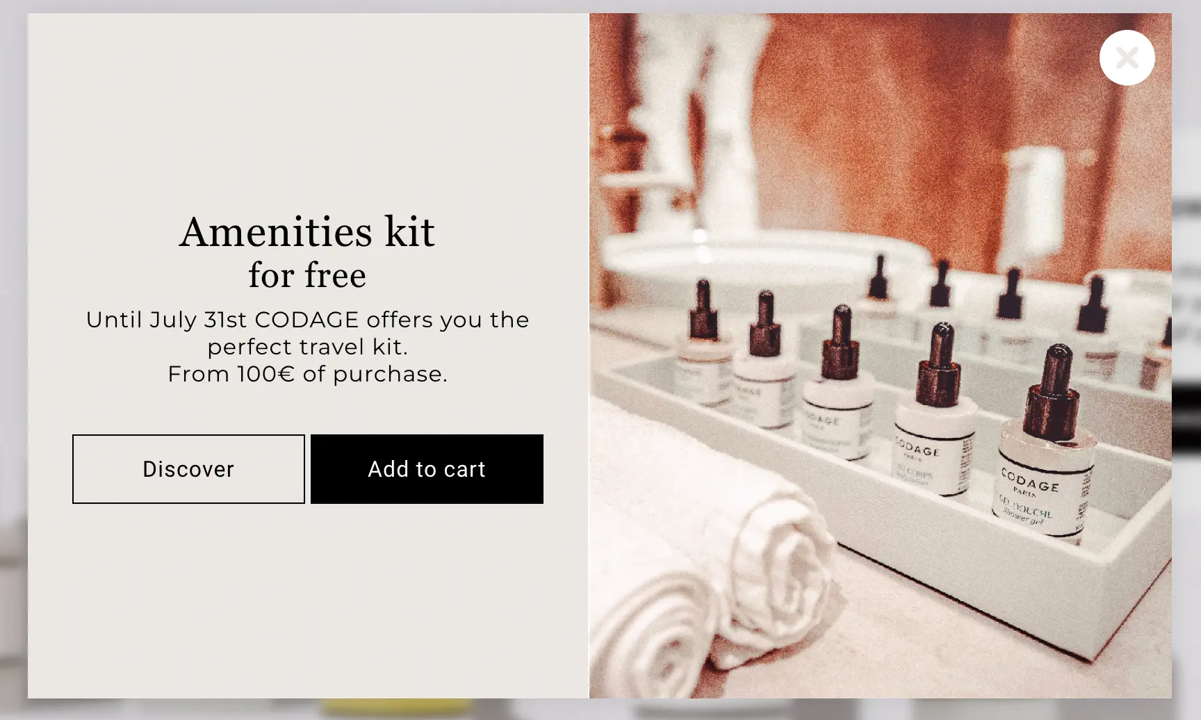

The main goal of this popup message is to help increase the average order value by offering a free product for orders over 100 euros. So, it's an example of a popup message promoting a type of BOGO product promotion offer—"buy to get a free product."
Best practices from this popup message:
Concise and clear text
The image with the product supports the popup message
There are two buttons: one to learn more about the promoted products and another to add them directly to the shopping cart
Get ideas and inspiration for your promos:
Examples of sales promotions (including BOGO)
7. Faguo: a giveaway popup message


"A pair to win every week" — this popup message gets straight to the point. As visitors of Faguo know, the brand sells high-quality sneakers (among other items), so getting a pair for free would be a nice deal. Besides, there's a chance to get a discount for future orders here, too.
Best practices from this popup message:
The text highlights the benefit of participating in the giveaway
Mentioning the previous winner adds credibility and serves as an encouragement to participate
Only the first name of the previous winner is mentioned, preserving their privacy
8. Stumptown Coffee Roasters: a social proof popup message
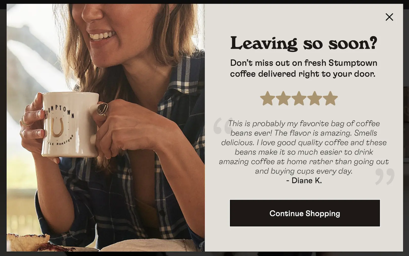

This social proof popup message example uses a customer review to showcase satisfied customer experiences. By presenting the collective approval of their community, the brand subtly encourages new visitors to keep shopping and join a group of coffee enthusiasts.
Best practices from this popup message:
Uses the persuasive power of social proof
Engages visitors by reflecting a community's endorsement
Encourages conversions by appealing to a specific service: a door-to-door coffee delivery
Write better and get more conversions: Use our popup copy and ecommerce copywriting guides
9. Simply Chocolate: an upsell popup message


This popup message appeared on Simply Chocolate when I added a product to the shopping cart, asking if I wanted to try a few other related items. I like the "Have you tasted our bestsellers?" question, which could be quite intriguing for chocolate fans.
Best practices from this popup message:
Confirms that the product has been added to the cart
Clearly conveys what needs to be done to get the free shipping
Asks a question, which is an old copywriting technique that invites viewers to stop and think about the answer
Use upsell popups to sell more: How to create upsell popups [+examples]
10. Solo Stove: an informational popup message
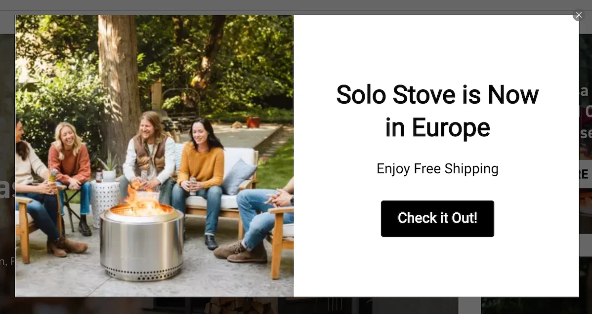

Solo Stove's popup message has two goals: to share the news about the brand's expansion to the new market and drive Europe-based visitors to the local website. I got this message while trying to visit a Texas-based Solo Stove's website from Europe.
Best practices from this popup message:
Drives visitors to recently launched local website
Offers an extra motivation to shop (free shipping)
The heading is in a large font to convey the message quickly and effectively
11. Death Wish Coffee: an SMS popup message


Death Wish Coffee uses this message as a part of a multistep popup to collect phone numbers from their visitors. The best part here is the playful tone of voice, which is one of the brand's most unique qualities.
Best practices from this popup message:
Playful and witty headline that grabs attention
Friendly and conversational tone of writing
Clear benefit ("Get 15% off") from subscribing
How to create a popup message
Follow these steps to create and add a popup to your website for free:
Create a popup
Choose a template
Add the popup message
Choose to show on exit
Publish your campaign
In this tutorial, we'll create a popup with a newsletter signup. Feel free to choose among these best popup tools to get started.
In this tutorial, I'll use Wisepops (rated 4.8 on Shopify).
If you'd like to follow along, get a free account:
Free trial for 14 days with all premium features included. No cc needed.


Step 1: Create a new campaign
In Wisepops, go to Create popup campaign in the Popups main menu:


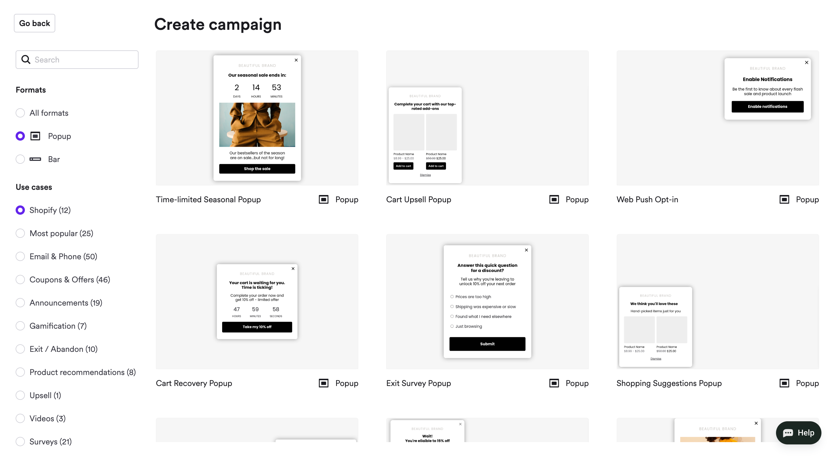
Step 2: Choose a template
In the template gallery, choose a template for your goal:

Step 3: Add the popup message
We're in the popup editor, so we can customize our template.
It's time to add your popup message!
Click the text and start writing or paste your popup message. To customize the font, size, and color, use the formatting menu above the popup preview:


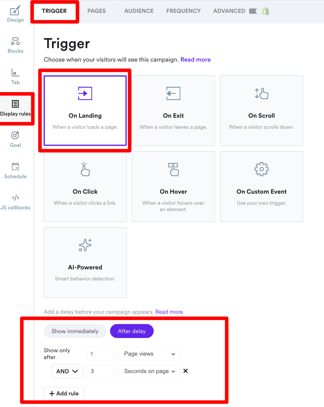
Step 4: Choose when to show
This popup message will show on your website three seconds after the visitor lands on the second page on your website.
To change timing, go to Display rules > Trigger:

Step 5: Publish your campaign
Your popup message is ready to be displayed to your visitors.
You can save it and see how it would look on your website with the preview feature.
To have it shown on your website, add the Wisepops code snippet (very easy to do): Check the guide here
And if you'd like to have the collected emails go straight to your email app, visit Integrations.
Summary
By incorporating these popup message examples and tips into your marketing strategy, you can seriously improve how you engage your visitors.
As you can see from these campaigns, popups aren't just about capturing emails with discounts; they're chances to sell, increase the average order value, and personalize shopping experiences.
Here are more helpful resources from our blog:
Get started
in minutes
Start converting more visitors today.
Get started in minutes and see results right after.

